Getting my book Virginia’s Ghost to a publishable stage has been a long haul. I’ve never been a swift writer, and between my plodding approach to writing, my editing work, and dealing with a chronic illness, I’ve been wondering if the book will ever come into being as a published work. Will something tangible really emerge from the endless writing and rewriting?
But now, with a completed book cover on my hands, I realize how close I am to the finish line. This cover has me glowing almost as much as the ghost is. Sure, seeing my name in lights as it were is a little ego boost, but there’s much more to the excitement than that–it’s thrilling to see how the designer has represented my book and captured its essence through images.
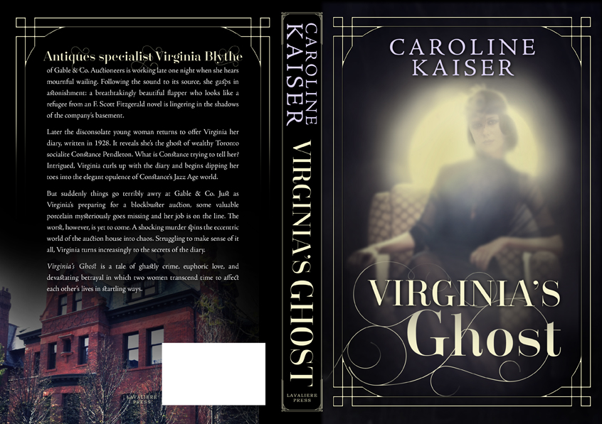
I was a bit nervous about the design process at first. What if the designer couldn’t connect with my book and produced something I felt lukewarm about? But with a designer like Scarlett Rugers, I needn’t have worried. After reading Virginia’s Ghost, she came up with three excellent cover concepts, all of which reflected the great extent to which she’d absorbed my book. Concept one was very colourful and showed a small ghost on the balcony of a Victorian house, while concept two depicted the blurry figure of a ghost ascending basement stairs. But concept three, which you see here, was definitely the one, and it was Scarlett’s favourite too. Her version of Constance the ghost matched very closely the Louise Brooks-like image I’d been carrying around in my head. But to ensure I wasn’t utterly misguided in my choice, I sent the cover concepts to various people I knew including editors and other writers, very few of whom had actually read the book. While the results weren’t unanimous, concept three was preferred by most.
I liked Scarlett’s thoughtful approach to the design. When I asked her why she hadn’t chosen an art deco font, which was what I’d expected, she replied that this might mislead readers into thinking that all the book takes place during the 1920s, which isn’t the case. Pondering her decision, I couldn’t agree more. The image of the flapper ghost and the border design allude to the 1920s, whereas the bold and glamorous title font gives readers a whiff of the present.
We made a few adjustments to Scarlett’s original concept–shifting the title down to reveal more of the ghost’s hands, for example, and decreasing the size of my name, which I thought was competing with the title for attention. On the back, we’d originally had an author blurb and photo, as I had really wanted this, but the text covered much of the red-brick mansion and wasn’t that readable even though Scarlett had darkened the house behind it. Something had to go, but it wasn’t the mansion. I wanted it in for two reasons: a good friend of mine, Louise Kiner, had taken the photo, and the house represents the one the ghost inhabited when she was alive. Once the extra bit of text was gone, Scarlett was able to brighten the mansion, allowing it to shine forth in all its gloomy glory!
After some back and forth and lots of nitpicky little decisions, I finally have a book cover. And I couldn’t be happier with the result. Many thanks to Scarlett for her inspired design!
 Follow